📄 Summary: What You’ll Learn in This Article
This article explains how to create a Smart Chart in the Marmind Dashboard module using the four-step Smart Chart Wizard. It guides you through selecting a chart type, defining filters and hierarchy levels, choosing KPIs, and customizing chart grouping and formatting—so you can build dynamic, context-sensitive visualizations that update automatically.
-
Step-by-step guide to create a smart chart in the dashboard module
🧑🤝🧑 Who Should Read This?
This article is most useful for:
-
Team Leads / Department Heads
Users who want to create customized dashboards to monitor performance or KPIs for their team or area of responsibility. -
Project Managers
Those who need to track project progress, budgets, or timelines using visual dashboards. -
Analysts / Power Users
Users with a deeper understanding of the data and hierarchy structures, who regularly build and share insights via charts. -
System Trainers / Internal Champions
People responsible for onboarding others or maintaining best practices around dashboard usage.
✔️ Prerequisites: What Should You Know Before Getting Started?
Level: Easy
Access required: Depending on your organization settings
-
The following prior knowledge is useful for this article:
-
Basic Navigation in Marmind
-
Understanding of Hierarchy Contexts
-
User Permissions and Access Rights
-
General Concept of Dashboards and Charts
-
Overview
Smart Charts dynamically recalculate based on the selected hierarchy context and are the recommended chart type in Marmind. When you click “Create Smart Chart”, a 4-step wizard opens to guide you through chart setup.
Step-by-Step Guide on how to create a smart chart
-
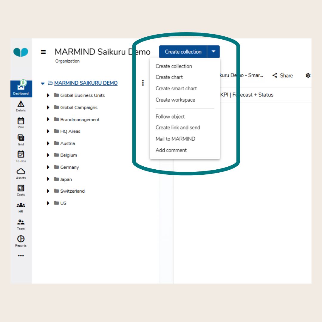
Navigate to the Dashboard module.
-
Click the blue button in the top-right corner.
-
Select “Create smart chart” from the dropdown menu.
-
The Smart Chart Wizard will open.
Smart Chart Wizard: Step 1 (Chart type)
On the first page, choose the visual format for your chart. Click one of the options to highlight it.
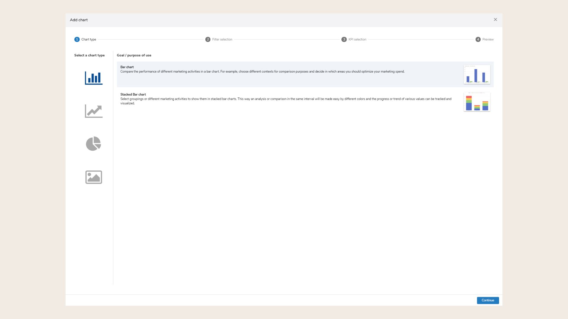
Common Chart Types:
-
Bar Chart: Compare activities side-by-side (e.g., cost by market).
-
Stacked Bar Chart: Compare grouped data with color-coded segments.
-
Line Charts: Visualize trends over time.
-
Stacked Line Chart: Similar to line charts but layered for comparison.
-
Pie Chart: Show percentage share of a KPI (e.g., spend type).
-
Benchmark Tile: Compare a KPI to a benchmark (e.g., actual vs. plan).
-
Live Value Tile/KPI tile: Show current KPI value with or without trend comparison.
You can preview your selection. Click Continue to proceed.
Smart Chart Wizard: Step 2 (Filter selection)
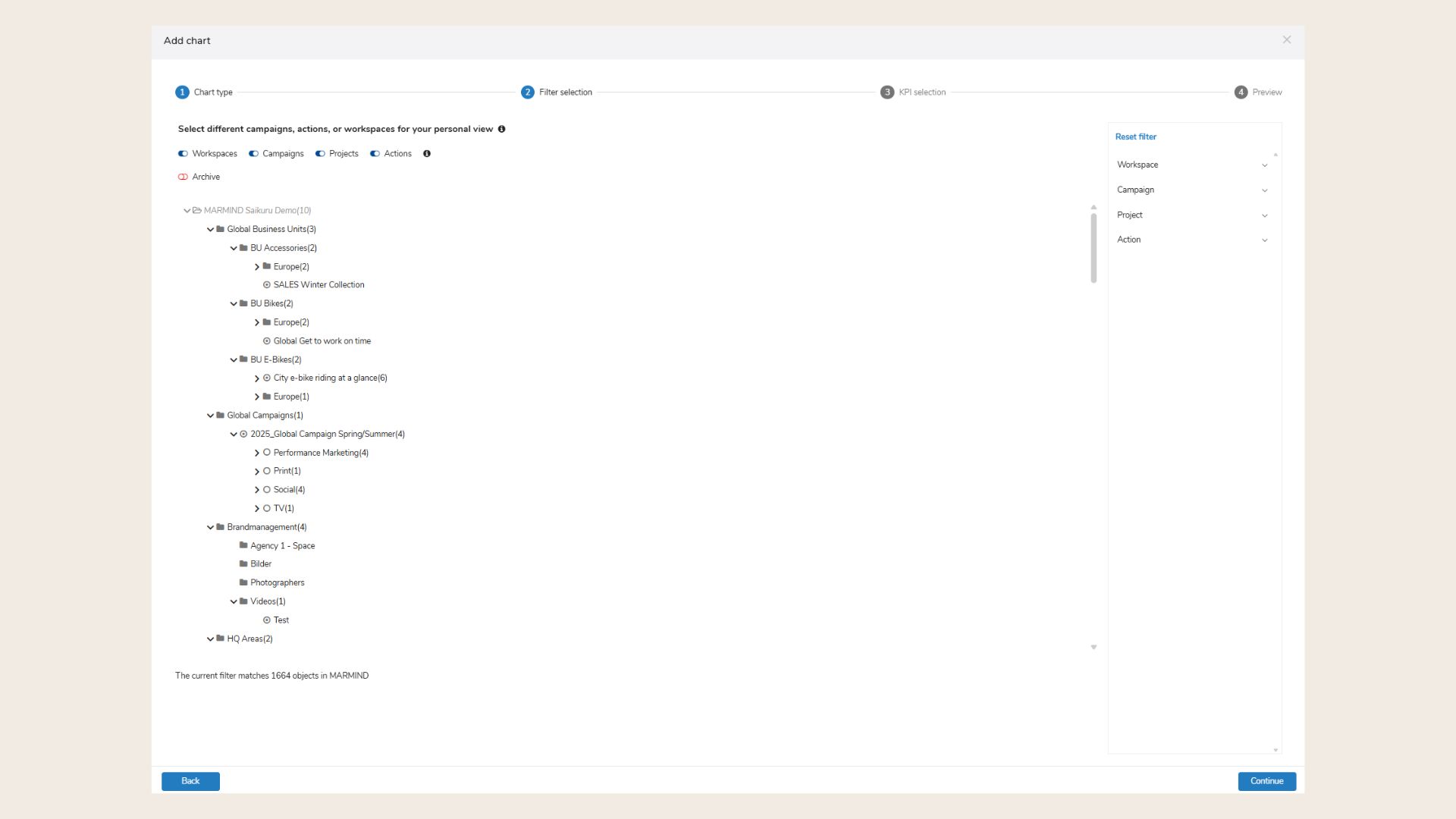
-
Use the hierarchy togglers at the top to select one hierarchy level.
-
Only one hierarchy should be selected to avoid nested hierarchy issues.
-
-
Below the togglers, you'll see a list of included contexts.
-
Use filters on the right to refine your data (e.g., by name, category, tag, or custom fields).
-
Click “Add filter” to apply custom filters.
-
This is useful if you want to pre-filter for certain values in your final chart.
-
Click Continue to proceed.
Smart Chart Wizard: Step 3 (KPI Selection)
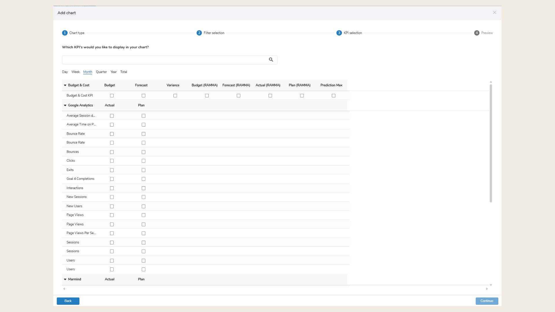
-
Use the search bar to find available KPIs (currently: Budget, Costs, Variance).
-
Select the granularity (interval) for KPI values:
-
Months – Recommended for accurate timeline analysis.
-
Quarter / Year – Also available and calculated automatically.
-
Day / Week – Not used in BMW's setup (results in empty charts).
-
-
Use the checkboxes to select one or more KPIs.
-
Compatible KPIs can be combined (e.g., Budget + Variance).
-
Budget aggregates top-down.
-
Forecast aggregates bottom-up.
-
Click Continue to move to the final page.
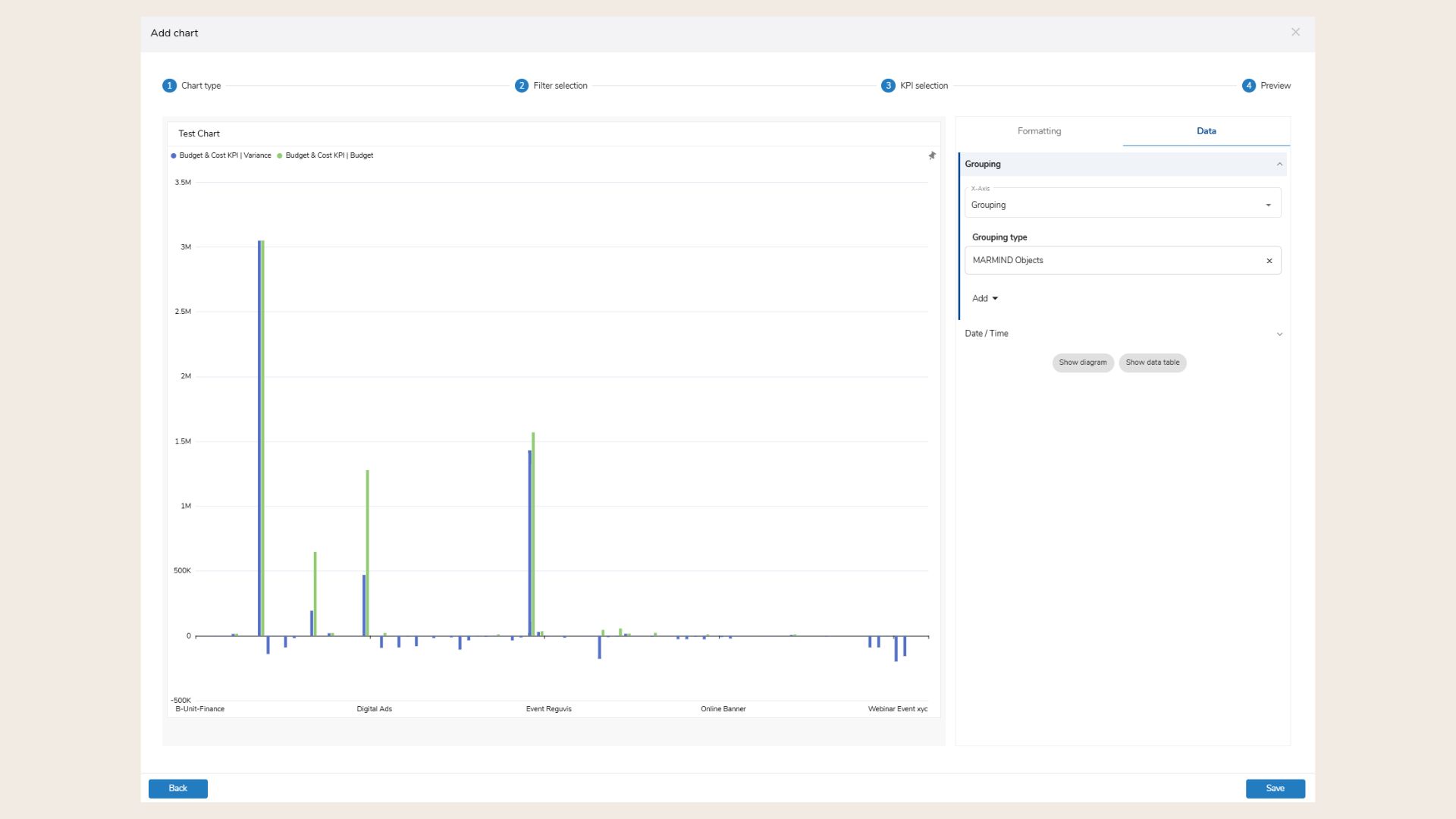
Smart Chart Wizard: Step 4 (Data)
-
Choose how to group your data:
-
Date (X-axis) – Adds a timeline (Month, Quarter, Year).
-
Groupings – Group by variables such as:
-
Marmind Objects
-
Target Audience/Action category/Product
-
Folder / Channel / Activity Categories
-
Budget/Spend Type
-
Custom fields (must match selected hierarchy)
-
-
-
You can choose up to 2 grouping variables.
-
Set a timeframe under "Date/Time":
-
E.g., “Current Year”, “Last Quarter”, or Custom Range
-
-
Add indicators (only when Date is selected):
-
Variance (absolute or %)
-
-
Choose how the chart will appear:
-
Diagram (visual chart)
-
Data Table
-
You can remove a grouping by clicking the “x” next to it.
With the Button “Show diagram” or “Show data table”, user can select if they want to add the chart via a diagram or via data table as default view.
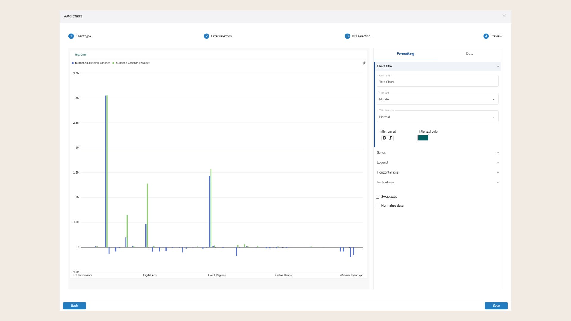
Smart Chart Wizard: Step 4 (Formatting)
-
Chart Title:
-
Change title, font, size, format, and color.
-
-
Series:
-
Edit chart series (Bar, Line, Area, etc.).
-
Adjust color, opacity, and data point label positions.
-
-
Legend:
-
Show/hide legend, choose position and styling.
-
-
Horizontal Axis:
-
Customize label font, color, slant, and order.
-
Click Show Diagram or Show Data Table to preview your chart.
-
After configuring all settings, click “Save” to add the chart to your dashboard collection.
-
The chart will appear in the next free space in your dashboard grid.
-
To exit without saving, click the “X”.
-
Use Back / Continue buttons to navigate through the wizard at any time.
🧠 Pro Tips
-
Always select a matching hierarchy for custom fields to ensure consistent results.
-
Be cautious with multi-select custom fields — values will be duplicated per selection and totals may exceed the actual budget or costs.
❓ FAQs